Senior Services
Compass Senior Transitions
A senior placement and home sale service where the entire design job was earning trust
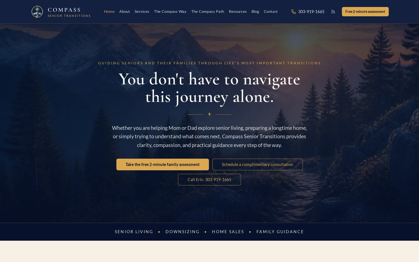
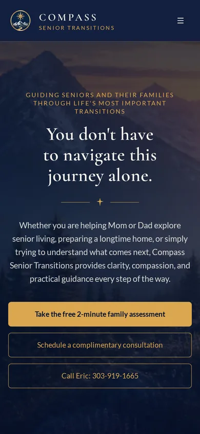
Compass Senior Transitions helps seniors find placement and sell the home they are leaving. The site had to carry an existing print identity into digital and, more importantly, had to feel trustworthy to an adult child making a hard decision on a parent's behalf.
The person reading this site is usually not the person moving. It is an adult child, often at a difficult moment, evaluating whether to hand a stranger both their parent's living situation and their parent's largest asset. Nothing about that decision is made on features.
The brief
What the engagement had to deliver
Compass Senior Transitions came to us with a clear set of outcomes rather than a page count. Everything below was agreed before design started.
- Extend an existing print identity, business card and brochure, into a full digital brand
- Build the messaging around trust rather than around service features
- Serve the adult child making the decision as much as the senior making the move
- Connect the placement service and the home sale without either feeling like an upsell
Key challenges
What made this build harder than a template
- The dual service, placement plus home sale, can read as a conflict of interest if it is presented carelessly
- The real audience is an adult child under emotional strain, and the tone has to meet that without becoming saccharine
- Accessibility and readability matter more here than on almost any other site, for both audiences
- The existing identity was designed for print and had to survive translation without being redrawn
Our approach
How we built it
We carried the print identity across faithfully, colors, typography and feel, because a family holding the brochure and then opening the site should see one company. The messaging was built around trust as the primary job: who does this, why they do it, what happens at each step, and what the family should expect. The two services are presented as one coherent transition rather than as a bundle, which is what removes the conflict-of-interest reading. Type sizes and contrast were set generously enough to serve both an older reader and an adult child reading on a phone in a hospital corridor.
The front end
What visitors see
- Existing print identity carried faithfully into digital across color, typography and feel
- Trust-first messaging structure leading with people and process rather than services
- Placement and home sale presented as one transition rather than a bundled upsell
- Step by step expectation setting for families entering the process
- Generous type sizing and contrast serving both older readers and adult children
- Server-side rendered for complete first-request HTML
- Full mobile treatment
The stack
What it is built on
- TanStack Start
- React 19
- TanStack Router
- Tailwind v4
- shadcn/ui
- Server-side rendering on Cloudflare Workers
Results
What changed
- One coherent brand across the business card, the brochure and the website
- A trust-led message that speaks to the person actually making the decision
- Two services presented as a single transition rather than a cross-sell
- A reading experience that works for both audiences without compromise
Since launch
Where the new enquiries come from
The person researching senior placement is usually an adult child under stress, and the first question goes to an assistant late at night. Compass reports that these visitors arrive already understanding the process and already inclined to trust it.
What the client reports
- First contacts describing their parent's situation rather than asking what the service is
- Families arriving having read the process end to end before calling
- Assistants named when families are asked how they found the service
- Conversations that begin at next steps instead of at reassurance
Why an answer engine can quote this site
- The process is written out in order, in plain language, with nothing important held back for a call
- Difficult questions answered directly under headings phrased the way families ask them
- Server-rendered so the whole explanation is available on the first request
- Trust signals stated as verifiable facts rather than as adjectives
The points above are what the owner tells us, not analytics we audited on their behalf. We publish them as reported rather than dressing them up as measured numbers.
Common questions
Questions about the Compass Senior Transitions build
Who actually reads a senior placement website?
Usually an adult child rather than the senior, often at a stressful moment and frequently on a phone. Writing for the person moving while ignoring the person deciding means missing the reader who is actually there.
How do you present placement and home sale together without it looking like a conflict?
By presenting them as one transition rather than two products. A family leaving a home and entering care is going through a single event, and describing it that way is both more honest and more reassuring than bundling two services.
Does a print identity translate directly to a website?
Not automatically. Print controls the surface and the size, and digital controls neither. Carrying an identity across means keeping the color, type and feel recognizable while rebuilding the mechanics for screens and accessibility.
- Services
- Website, Design System, Brand Extension
- Sector
- Senior Services
- Client
- Compass Senior Transitions
- Build window
- Phased build
Capabilities used
What this platform runs on
Building something similar in this sector? See the senior services platform guide, or read how a custom business operating system fits together, then book a discovery call.
Related work
Other platforms we have built
Luxury Real Estate
Brandon Rearick
Brandon Rearick is a REALTOR with eXp Realty serving Boulder County and Northern Colorado. The design brief was to look less like an agent template and more like Christie's or The Agency, because a site that looks like every other agent site cannot credibly list a property that does not.
Telehealth
StemVera Health
StemVera Health is a Denver telehealth practice. The build began from an intentionally opinion-free scaffold so that every architectural and visual decision was made against the actual brand rather than inherited from a template that happened to be there first.
Faith Community
The Herd
The Herd is a membership platform for a men's ministry community. It carries accounts, membership billing and community programming, but it was deliberately built to feel like a premium brand site rather than a church application, because the men it is trying to reach would not download a church application.
Want a site that works this hard for your business?
Bring us the workflow you are tired of duct taping together. We will show you what it looks like as one owned platform.