Faith Community
The Herd
A men's ministry platform that reads like a whiskey distillery, not a church app
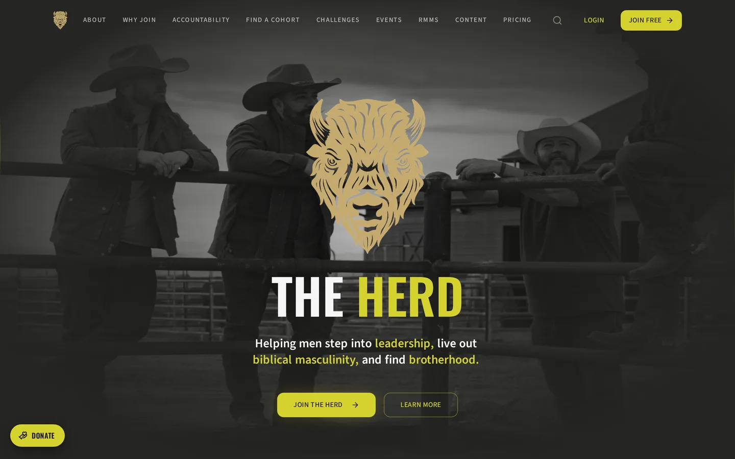
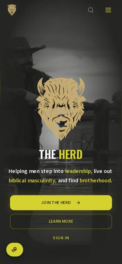
The Herd is a membership platform for a men's ministry community. It carries accounts, membership billing and community programming, but it was deliberately built to feel like a premium brand site rather than a church application, because the men it is trying to reach would not download a church application.
Ministry software looks like ministry software. Soft gradients, stock photography of people laughing at salad, and a visual language that quietly signals this is not for you to exactly the men it is trying to reach. The design problem was the outreach problem.
The brief
What the engagement had to deliver
The Herd came to us with a clear set of outcomes rather than a page count. Everything below was agreed before design started.
- Build a men's ministry platform that a man would show another man without explaining it first
- Carry real membership functionality, accounts, billing and programming, underneath the brand surface
- Reach for an industrial barn modern aesthetic closer to a cycling brand or a distillery than to church media
- Keep it a website in feel rather than an app in feel, even though it is an application
Key challenges
What made this build harder than a template
- The entire premise depends on not looking like the category it belongs to, which means every default visual instinct had to be argued with
- A single high-chroma gold against dark industrial tones is a narrow band to stay inside without it turning garish
- Membership billing and community programming have to coexist without the product becoming a dashboard
- The audience skews toward people who are skeptical of software, so anything that felt like a portal login would lose them
Our approach
How we built it
The design system was set before anything functional was built, because the aesthetic was the strategy rather than a coat of paint applied later. Industrial barn modern gave us dark grounds, real texture, and a single assertive gold that carries every action on the site. Underneath, membership runs on Supabase auth with Stripe handling recurring billing, but none of that machinery is allowed to surface as chrome. The result reads as a brand you would follow rather than a system you were assigned.
The front end
What visitors see
- Industrial barn modern design system with dark grounds and a single high-chroma gold accent
- Brand-forward marketing surface that reads as a website rather than an application shell
- Community programming and content surfaces integrated into the same visual language
- Member account experience that avoids portal chrome entirely
- Full mobile treatment carrying the same visual weight as desktop
The back end
What the business runs on
- Supabase authentication and Postgres with row level security on member-scoped tables
- Stripe recurring billing for membership
- File and media storage for community content
- Member state and community programming served from one database
The stack
What it is built on
- Vite
- React
- TypeScript
- Tailwind
- shadcn/ui
- Supabase
- Stripe
Results
What changed
- A ministry platform that does not look like a ministry platform, which was the entire brief
- Membership billing and community programming running under a brand-first surface
- A design system distinctive enough to carry into print and physical spaces
- An application that men will open without it feeling like an obligation
Common questions
Questions about the The Herd build
Why does a ministry platform need a premium design system?
Because design is the first argument the product makes. A men's ministry trying to reach men who are skeptical of church culture loses that argument before a word is read if the site looks like every other church site.
Can a membership site handle billing without feeling like a dashboard?
Yes, but only if the billing is treated as a background system rather than a feature to display. Account and payment surfaces here are deliberately quiet and carry the same visual language as the rest of the site.
What does industrial barn modern mean as a design direction?
Dark grounds, real material texture, heavy type, and restrained accent color. The reference points are closer to a distillery, a cycling brand, or a converted barn event space than to anything in the church media category.
- Services
- Business OS, Web App, Membership Billing
- Sector
- Faith Community
- Client
- The Herd
- Build window
- Phased build
Capabilities used
What this platform runs on
Read how a custom business operating system fits together, then book a discovery call.
Related work
Other platforms we have built
Senior Services
Compass Senior Transitions
Compass Senior Transitions helps seniors find placement and sell the home they are leaving. The site had to carry an existing print identity into digital and, more importantly, had to feel trustworthy to an adult child making a hard decision on a parent's behalf.
Children's Publishing
Bookworms Publishing
Once Upon a Me is a voice-driven storybook creator. A child between three and ten speaks their imagination to an AI story friend named Pip, who co-creates a twenty-four page picture book with them. A parent then reviews it, pays, adds a private inside-cover message, and a printed keepsake ships.
AI Software
MentorOS
MentorOS is an AI mentorship platform built around a life domains framework and a persistent memory layer. Conversations carry forward across sessions using vector memory, so the mentor builds a picture of the person over months rather than restarting from zero every time the tab closes.
Want a site that works this hard for your business?
Bring us the workflow you are tired of duct taping together. We will show you what it looks like as one owned platform.