Membership Organization
NOCO Women's Chamber
A women's chamber built to recruit members, not just to serve the ones it already has
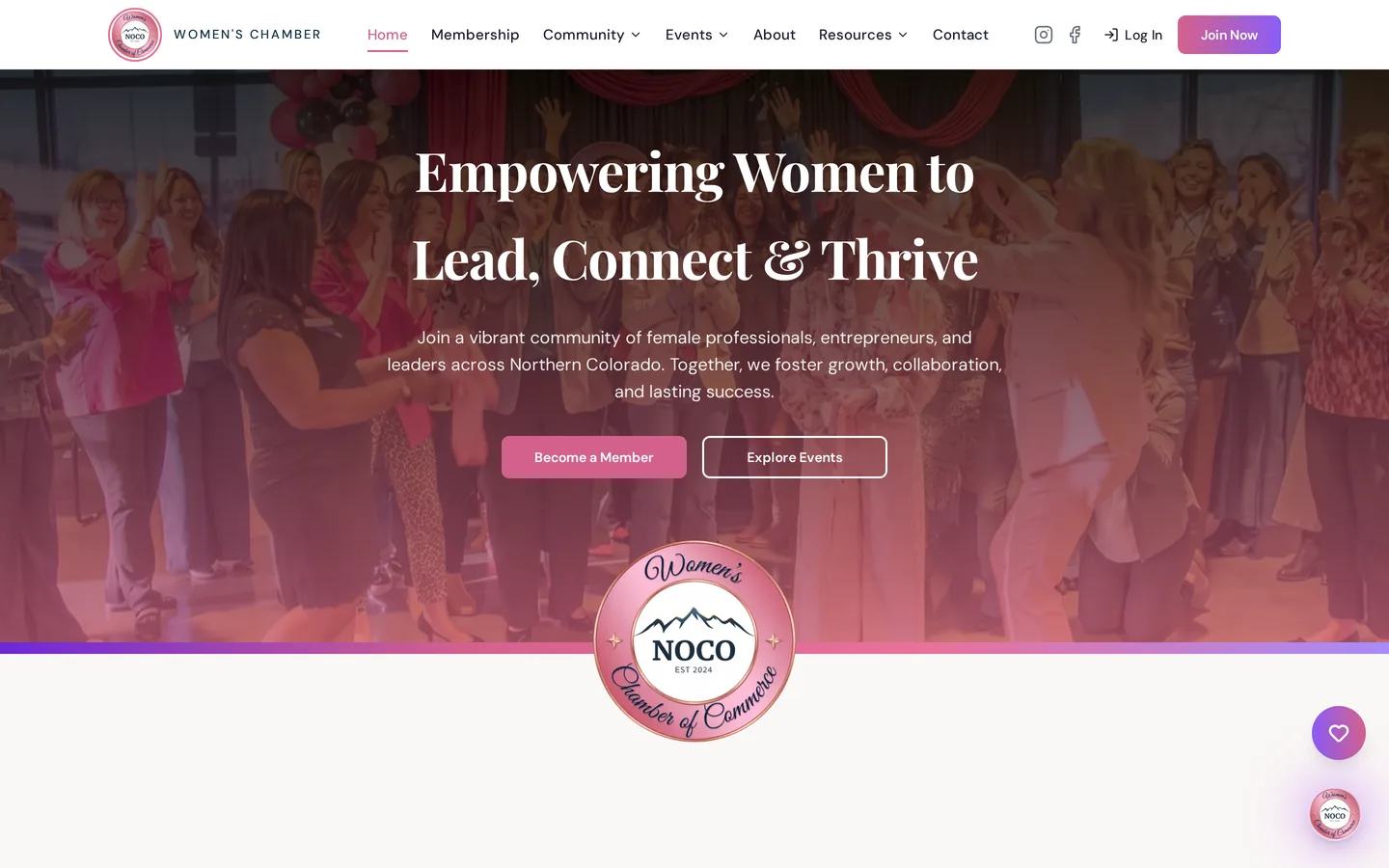
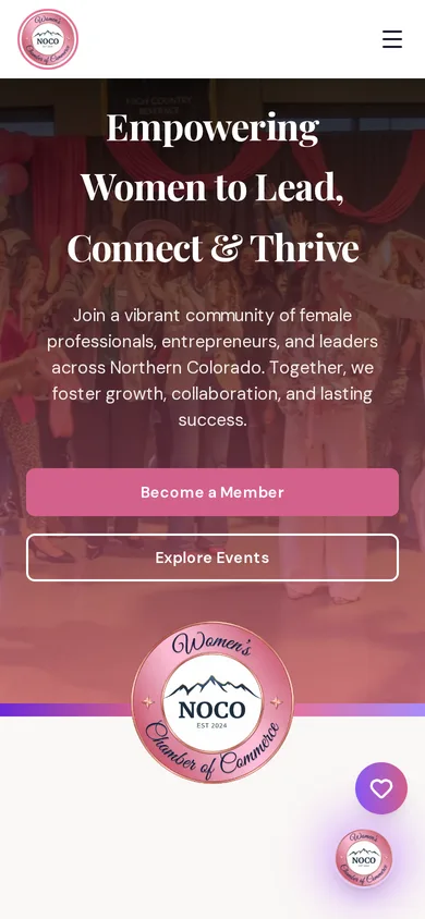
The NOCO Women's Chamber needed a site that works as a recruitment surface first and a member utility second. The visual system was derived from the organization's rose gold badge, carrying a metallic quality into a digital design language that usually flattens it.
Chamber websites are built for people who already joined. Event calendars, member directories, board minutes. The prospective member, the one deciding whether this organization is worth her time and her fee, gets almost nothing, because the site assumes she is already inside.
The brief
What the engagement had to deliver
NOCO Women's Chamber came to us with a clear set of outcomes rather than a page count. Everything below was agreed before design started.
- Build a site that recruits prospective members rather than only serving existing ones
- Derive the visual system from the organization's rose gold badge identity
- Carry a metallic, lit quality into a digital design language
- Serve members and prospects from one site without either being an afterthought
Key challenges
What made this build harder than a template
- Metallic finishes are a print and physical property, and reproducing that quality on screen without cheap gradient effects is genuinely difficult
- Membership organizations naturally accumulate internal content that crowds out the recruitment message
- Rose gold is a narrow palette that turns pink or turns brown very easily
- Prospective and current members want almost opposite things from the same navigation
Our approach
How we built it
The design system started from the badge, working out how to carry a lit metal quality into screen without resorting to the gradient tricks that read as cheap. Rose gold was treated as a narrow band with deliberate neighbors rather than as a single accent color applied everywhere. Structurally, the recruitment case leads. What the chamber is, who it is for, and what membership actually delivers come before the calendar and the directory, which are member utilities and belong further in. That ordering is the entire difference between a chamber site that grows and one that maintains.
The front end
What visitors see
- Visual system derived from the organization's rose gold badge identity
- Metallic lit quality carried into screen without cheap gradient treatments
- Recruitment case leading the structure ahead of member utilities
- Member-facing calendar and directory surfaces positioned as utilities rather than as the homepage
- Server-side rendered so the recruitment content is fully indexable
- Full mobile treatment
The stack
What it is built on
- TanStack Start
- React 19
- TanStack Router
- Tailwind v4
- Server-side rendering on Cloudflare Workers
Results
What changed
- A chamber site that argues for membership before it serves membership
- A distinctive identity derived from the physical badge rather than a generic palette
- Prospects and members served from one site with clear ordering between them
- Recruitment content fully available to search and answer engines
Common questions
Questions about the NOCO Women's Chamber build
What should a chamber of commerce website lead with?
The case for joining. Event calendars and member directories are utilities for people who already belong, and putting them first tells a prospective member the site was not built with her in mind.
How do you reproduce a metallic brand finish on screen?
Carefully, and usually not with gradients. A lit metal quality comes from contrast, restraint and how the color sits against its neighbors, rather than from the shine effects that read as dated the moment they load.
Can one site serve current members and prospective members?
Yes, provided the ordering is deliberate. Recruitment content leads and member utilities sit deeper. Trying to give both equal prominence on the homepage means the prospect never finds the argument for joining.
- Services
- Website, Design System, Membership
- Sector
- Membership Organization
- Client
- NOCO Women's Chamber
- Build window
- Phased build
Capabilities used
What this platform runs on
Read how a custom business operating system fits together, then book a discovery call.
Related work
Other platforms we have built
Faith Community
The Herd
The Herd is a membership platform for a men's ministry community. It carries accounts, membership billing and community programming, but it was deliberately built to feel like a premium brand site rather than a church application, because the men it is trying to reach would not download a church application.
Senior Services
Compass Senior Transitions
Compass Senior Transitions helps seniors find placement and sell the home they are leaving. The site had to carry an existing print identity into digital and, more importantly, had to feel trustworthy to an adult child making a hard decision on a parent's behalf.
Direct to Consumer
Rip the Labels
Rip the Labels is a keepsake guided journal for women, sold direct. The brand moved off Shopify onto a platform it owns, carrying the full commerce path, product pages, cart, Stripe checkout and order confirmation, plus payment monitoring most storefronts never get.
Want a site that works this hard for your business?
Bring us the workflow you are tired of duct taping together. We will show you what it looks like as one owned platform.